This is the first design. The OpAmp is a important component in analog circuits. This simple symbol is so closely related to our major – Electronic Engineering. But it is toooooooooo simple!

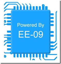
Then came a more complicated one. The CPU is the core of the modern electronic systems. This logo implies that the future will be powered by our design. However, it looks really awkward.

This is the third design. I put more artistic element into it so the color, the lighting are much better. Also, it is has more depth and 3-dimensional feeling. However, the color scheme is too complex for printing it on clothes.

Here’s the final design. Still based on a amplifier but much better. The signal pulse makes the logo full of energy and represent our creative ideas. These ideas are amplified by the OpAmp and will power the future.
No comments:
Post a Comment